Showing posts with label architecture. Show all posts

Saturday, 31 May 2025

'Let Me Tell You a Story' by Fenella Brandenburg


Let Me Tell You a Story: Presupposed actualization and the discourse of architectural development plans.

By Fenella Brandenburg.

Limited edition: only 10 available.

This essay is by the infamous academic and agent provacateur Fenella Brandenburg. Brandenburg is well-known for her appearance as keynote speaker at the Fourth World Congress of Psychogeography (4WCOP) in September 2017 at Huddersfield University, alongside David Bollinger.

  • Published by Urban Gerbil
  • Size: A5
  • Pages: 33
  • Black and white images: 2
  • Colour images: 3
  • White cover with blue text


Abstract of essay:
This essay discusses how architectural development plans form a narrative that tells a story of the future space being proposed. This story, embedded in a discourse that is circulated by those in authority in regard to the project’s manifestation, has two main effects. Firstly, it changes the subjectivity of those involved in the decision-making process and, secondly, the ideological structure surrounding the development makes the anticipated project, in the minds of those involved, exist in advance. These effects are known as presupposed actualization. By providing an example of a development project carried out in the UK in the 1960s - and by using theories around narratology, ideology, discourse and representation – the author demonstrates how this comes about through the telling of a story and because of the material actions undertaken by those invested in the project.

You can buy your copy for £4.00 + UK postage.

Saturday, 4 July 2020

'Presupposed actualization and the discourse of architectural development plans' by Fenella Brandenberg


Let Me Tell You a Story: Presupposed actualization and the discourse of architectural development plans.

By Fenella Brandenburg.

Please click here for free downloadable copy of this essay.

Abstract of essay:
This essay discusses how architectural development plans form a narrative that tells a story of the future space being proposed. This story, embedded in a discourse that is circulated by those in authority in regard to the project’s manifestation, has two main effects. Firstly, it changes the subjectivity of those involved in the decision-making process and, secondly, the ideological structure surrounding the development makes the anticipated project, in the minds of those involved, exist in advance. These effects are known as presupposed actualization. By providing an example of a development project carried out in the UK in the 1960s - and by using theories around narratology, ideology, discourse and representation – the author demonstrates how this comes about through the telling of a story and because of the material actions undertaken by those invested in the project.


Wednesday, 9 March 2016

“God knows, who made elephants.” (Rudyard Kipling)

Image: Art Deco Burton elephant, with chevrons and fans in Belfast.

by Roger Boyle and Jeremai Smith

Slice an object and it will expose a face; slice a different way and see a different face. Slice the country along railway stations and see functionality, heritage, over-romanticised history and architectural vandalism; slice along the 1.9oW meridian and see Bournemouth, Foss Cross, Redditch, Wolsingham, Thunderton (inter alios). Slice along elegant art-deco Montague Burton buildings and see affordable elegance and style for the male masses – retail pride that became a piece of social engineering displayed in chevrons, fans and beautiful elephants now hiding away as charity chops, McDonalds, disintegrating ruins and, yes!, Burtons and Dorothy Perkins.

The history of Montague Burton is widely and well-known: a self-made Jewish emigre, arriving in 1900 and by 1950 bestriding British retail tailoring. Paternalistic and philanthropic, Burton knew how to make clothes and he knew how to sell them, as part of which his understanding of place and its exploitation was key. Burton did more than open shops; he shoehorned himself into the public expectation of a town's High Street. By 1939 he had nearly 600 outlets targeting his market in large working class conurbations and so “The Tailor of Taste” were bywords for “men's clothes”.

But he had a personal taste and interest in quality at a time when art deco was an agreeable rage, and his pedantic standards extended not only to high quality exteriors, but strenuous efforts at visibility. Burton instructed his developers to seek corner sites to maximise the prominence of his trademarks. Usually the shop occupied the street level - often with tiled entrances and window lights - and the first floor might be a billiard hall. This way you offer bait for your target customer at the same time as keeping him out of the pub and stoking your teetotal credentials. By 1939 Burton had shops from Folkestone to Stornoway, from the modest (Ashford), to the utilitarian (Aberystwyth) to the palatial (Wolverhampton), and spectacular factories to match. You can still see the Hudson Street factory buildings in Leeds, but the truly magnificent Burtonville on the East Lancs. Road was thoughtlessly demolished in 1975.

Much changes. The Tailor of Taste survives, sometimes in his original buildings, but more often those are now occupied by anything and everything else, so Montague's carefully crafted range now exhibits a different range: the dilapidated in danger of demolition (Attercliffe), the grand department store (Wolverhampton), restaurants (Greenwich), and the ubiquitous charity shop (many). When Big Mac arrived on our shores in 1974, he targeted Montague's sites as Burton were moving out, and they were always in places that Ronald recognised as well chosen. He started in Woolwich, but has since moved on. While the billiard halls have gone, reuse has by and large left the chevrons, fans and elephants in place. The beautiful window lights and tiles in Abergavenny are still proudly in place, but you need to struggle to read them in Aberystwyth (where the building is Grade II listed).

In 2016, looking at towns through the Burton prism is an act of exploration that is rewarding, sad, instructive and revealing. Nondescript street corners, overshadowed by 60s flyovers, or cluttered by commercial refuse containers, will sometimes have a tell-tale granite foundation stone naming an immediate member of the family, and when you look up it's all still there, connecting you straight back to the 1930s.

Tracking the remains of all 600 remains an ongoing task in High Street archaeology, but you can get a head start here on Google Maps under ‘Burton the Tailors Architecture’, to which notices of amendment or omission are especially welcome...

BIO: Roger Boyle is a dilettante psychogeographer part way through preparation of a monograph on “The Elephants of Ceredigion”; tracking Burton buildings is a welcome distraction. Jeremai Smith has been spotting Burton deco for some time and is author and maintainer of the most authoritative database and map of the structures known.

Saturday, 30 August 2014

The Park Tower Knightsbridge: Corn-on-the-Cob


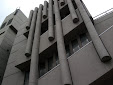
While at the Royal Geographical Society this week, I went for a stroll over to Knightsbridge and discovered another one of Richard Siefert’s buildings: The Park Tower (1973). Originally the Sheraton Park Tower (and previously the Skyline Park Tower Hotel) it is compared to Elmbank Gardens in Glasgow (according to Wikipedia), but how they could not compare it to One Kemble Street in Holborn is a serious oversight.


Park Tower was renovated in 2013 and the Hyde Park Penthouse Suite sells at £7,200/night in this brutalist hotel. You pay extra for your own butler. The cheapest room I could find was £319.
Centre Point is often considered to be Seifert’s most famous building, but it’s Tower 42 that’s actually my favourite London building. A few of his buildings have been demolished in recent times, Wembley Conference Centre, for instance.

On www.postwarbuildings.com it describes The Park Tower thus:
The building consists of a 15-storey rotunda housing 300 bedrooms, on a two-storey podium containing bars, a lobby and reception areas. The tower is formed of a reinforced-concrete service core, around which rooms are massed on a frame supported by pilotis at podium level. The most distinctive feature of the Park Tower is the façade treatment of the rotunda. Likened by Charles Jencks to corn-on-the-cob, each of the twenty rooms per floor, is articulated by a projecting bay window and clad in ochre mosaic. This gives the building an extremely tactile surface, while the rhythm of the windows goes some way to alleviating the bulk and emphasizing the vertical. This cellular façade treatment was a particularly Seifert architectural device and many of his buildings share this motif.

Relates blogs:
Negotiating Brutalist Space at the University of Leeds
Brutalist Access Points and Disappeared Stationers

Wednesday, 28 August 2013

One Kemble Street: The Sixties Space House


When in London last week, I turned off the Aldwych into Kingsway and caught a glimpse of this familiar building. I knew it from the nineties, when I was attending an evening class in the area at CityLit.


Completed in 1966 One Kemble Street used to be called the Space House and was designed by Richard Seifert, whose buildings included hotels, railways stations and office blocks. He was known for his 1960s and 1970s designs and for having been a big influence on London architecture during that period. According to scryscrapernews.com Seifert “originally designed the building to be a proper tower almost twice as high that would have served as a luxury hotel, but objections from Camden Council saw it reduced in height to what has been built today.” I actually like its stubbiness and don’t think doubling its height would have added anything to its aesthetic.


While Seifert is most famous for Centrepoint (which I also like), and the Natwest Tower, now called Tower 42 (my favourite London building), there is something about the smallness of the Space House that makes it more subtle and less ‘grand’ than the other two buildings. It’s like the difference between a sinewy Greyhound and a stocky Corgi. Both are lovely, and you wouldn’t reject the Corgi simply because it is small.


Relates blogs:
The Sound of the Sixties: Brutalist Architecture

Thursday, 15 August 2013

Negotiating Brutalist Space at the University of Leeds (part 2)

Inside, Outside, Upside, Upshot


This is part 2 of a psychogeographical blog on the E C Stoner Building at the University of Leeds. For part 1, please click here: Stoner, Stoned, Stonest

The room numbering on each floor are all categorised by type (see the third image below). For example, Level 8 has “Teaching Rooms” and “Teaching Laboratories” amongst other types of rooms. Within these categories the main room use is listed, alongside the number of that room, which is the floor number followed by a full-stop, then the number of the room itself, for instance 8.51 is “Physics and Astronomy Enquiries”. Each room then has an arrow next to it pointing in the direction it is. However, one might ask why there are some rooms on Level 8 that begin with the prefix ‘9’, which denotes a Level 9 room. It then becomes apparent, that the up arrow next to these ‘9’ prefixed numbers means upstairs to the next level (I am not convinced that without knowing the logic of the prefix number, as a visitor would not, that I would understand that I need to go up a level).


If you are already familiar with the way that the different geographical land height was dealt with by the architects Chamberlin, Powell and Bon (CPB) then a lift that only goes from floors 7 to 11 might not be too much of a surprise (see the first image above). However, what does make this idea complicated is that as a user of the campus, one is never exactly sure what level one is on, because the actual ground level is different in different parts of the campus. Therefore, while the entrance level in E C Stoner is level 7, the actual ground level is level 6, because on each of the entrances to the building you take stairs up before you enter it (I took this photo at a part of the building where level 6 was not accessible by that particular lift). However, in, say, the Edward Boyle Library, ground level (and entrance level) is level 9, because it is on higher ground. While this may have seemed like a logical approach by CPB, especially because of the use of walkways linking all these spaces together and making them appear seamless, it does require an explanation from someone ‘in the know’ to actually understand the complex logic.


This plan shows the colours that reflect the height of the ground, the steepest moving toward the North-West edge of the campus. The colours were translated into storey levels and used to help students and staff navigate the campus. This is an image from the Development Plan by the architects.

CPB also attached colours to each level in the buildings (see above). This colour-coding system was used in the Development Plans and also extended to the signs around the campus which appeared on signposts, corridor floors and on the outside of buildings as small coloured square plaques (Occasionally these small plaques can be seen around campus today, although most of them are gone). A large section of the 1963 plan covers this use of colour-coding by level. CPB explain that there was a “difference of 216 feet in elevation between the highest level within existing buildings on Woodhouse Lane […] and the ground level near the convergence of Clarendon Road and the Ring Road” (1963) They are referring to the difference in height between the Northern and Southern borders of the university and go on to explain in details the benefit of applying colour-coding to an area with the equivalent of eighteen storeys, summarising by saying “In a nutshell, the colour identification is intended as an aid to understanding the position of places in three dimensions instead of two” (ibid.).


Nevertheless, I would argue that people moving about the campus generally see that space as being three-dimensional rather than two, and it is only when space is collapsed into a representation in the form of a map or plan, that two-dimension becomes the ‘normal’ view of space. While I think the motive behind the colour-coding and unintuitive level numbering was probably one of being considerate to the user of that space, I am not convinced that the complex spatial ordering of the minds of the architects translated very well into to the use of campus space for those concerned, in this regard at least.

It is at times like these that urban planners and architects could do well to employ psychogeographers!

Other University of Leeds architecture-related blogs:
The Psychogeography of Other Spaces
Emotionally Mapping the Campus

Saturday, 8 August 2009

The Corporate University: Excellence . . . Schmexellence

Bill Readings describes 'excellence' as an empty, circular term that cannot be applied across fields; as he explains in a whole chapter dedicated to this phenomenon: “An excellent boat is not excellent by the same criteria as an excellent plane.” (1999: 24). Readings text is influenced by, amongst others, Jean-François Lyotard's The Postmodern Condition: A Report on Knowledge (1979) and this is apparent when Readings discusses the more 'performative' aspects of excellence's measure: “[...] the question of the University is only the question of relative value-for-money, the question posed to a student who is situated entirely as a consumer [..]” (Readings 1999: 27). He also makes reference to how this consumer-orientation of the university ties in with technology, which is also a large focus of Lyotard's critique. Readings says: “All that the system requires is for activity to take place, and the empty notion of excellence refers to nothing other than the optimal input/output ration in matters of information.” (1999: 39). I would now like to turn to an example, provided by Readings, of how choices based on these performance measures actually impact urban space; I shall also examine the same phenomenon at the University of Leeds: car parking.

Readings provides a anecdotal example of how space is utilised at the University in relation to excellence. Jonathan Culler informed Readings that the University at which he worked, Cornell in New York State, had received an award for “excellence in parking” (Readings 1999: 24). While one might assume that this meant the Car Parking Services Department was efficient at getting cars in and out of the car park, and/or effectively utilising the space, so as to get as many in as possible, what it actually meant was - and I shall use Readings own words and italics here, so as to allow the irony to appear - “that they had achieved a remarkable level of efficiency in restricting motor vehicle access.” (ibid). Readings explains how the term 'excellence' has a function that enables it to work on either side of what can be considered as excellence: it becomes translatable and usable by anyone who wishes to describe excellence within any phenomenon, in whatever way they choose, by any criteria (ibid).

During the major planning drive of the University of Leeds that took place after World War II, and in particular during the 1960s, architects were employed to draw up plans to expand and develop the campus. Many architectural plans were made, alongside two large bound proposals prepared by the architects Chamberlin, Powell and Bon. These were: University of Leeds Development Plan: being a report on proposals for the way buildings could be planned and laid out to accommodate both the present needs and the growth of the size of the University which may be expected during the coming decade (1960) and University of Leeds Development Plan Review 1963: being a review of three years' progress on the Development Plan published April 1960 (1963). Much of the work is oriented towards a section of the campus that is referred to as “the precinct”. One of the drawings/maps provided in the 1963 review states next to it “This drawing indicates the relationship between the new development and the existing street pattern.” (Chamberlin, Powell and Bon 1963: 167). The map of the university, as it existed at the time, has the planned buildings superimposed over the existing area, so that both are visible. The precinct area includes plans for a number of very large buildings and vast car parking zones. Part of the conclusion of the report says the following:
No effort has been spared in Leeds on the part of the City Authorities, the Hospital Board and the Council of the University to make the planned expansion possible despite the extreme difficulties inherent in the comprehensive re-planning and redevelopment of the old City sites which have hitherto rested in many ownerships and were laid out between a network of streets obsolete for any present purposes. (Chamberlin, Powell and Bon 1963: 269).


It is only when viewing the above-mentioned drawing, that it becomes apparent what the architects mean by “a network of streets obsolete for any present purposes”. The precinct in particular, but also many other areas of the proposed site, are terraced housing. This is made even more clear when looking at an aerial photo of a section of the University of Leeds campus, taken in 1953. Whole streets of terraced houses needed to be 'acquired' in order to become University property, and then be demolished so that the development plan could be put in place. This was done with the aid of Compulsory Purchase Orders (CPOs).

Bibliography
Chamberlin, Powell and Bon. 1963. University of Leeds Development Plan (Leeds: The University of Leeds).

Readings, Bill. 1999. The University in Ruins (Cambridge, Massachusetts and London: Harvard University Press).